Tuesday, November 3, 2009
Swagger

Posted by James Walker at 10:46 AM 1 comments
Friday, May 15, 2009
So Be Alive
Objective: Create a fresh new ad campaign for SoBe Life Water. Choose a target audience and make design choices that would cater to them.
Solution: This project was really fun. I was able to act as the creative director for my group. I had the opportunity to come up with the concept for the entire campaign and then work with my group to execute it. We chose to target seventeen to forty year old active adults. The concept is "So Be Alive". In the three print ads I wanted to use people who have overcome certain challenges in life to thrive in their chosen walk of life. This would give the campaign a feel good "you can do it" attitude that is something people need in the current state of the world. For our outdoor/unconventional ads we chose to place positive quotes in certain places that active people would see them. For the TV Spot we chose to do a flash animation to the chorus of the T.I. song "Live Your Life". The drop morphs into a wave that splashes into a mountain that changes into a track, and ends with the SoBe bottle.
(click ads to to read body copy)


Posted by James Walker at 10:31 PM 0 comments
Sentry Pest Control
Objective: Create an ad campaign for a local service related business. Choose a target market and successfully execute a campaign that they will respond to.
Solution: I chose to do a pest control company. The target audience predominately consists of “Mother Hens.” This is a psychographic profile that has been attached to married or single mothers in their late twenties to early forties. Generally, mothers in this age bracket spend countless hours caring for their children. They desire nothing more than the safety and comfort of their sons and daughters, especially around the home. The campaign slogan is “This is not Child’s Play.” This tag line accomplishes two tasks. First, it implies that the competition is more interested in the profit than the customer. Second, it suggests that Sentry, in contrast, cares first and foremost about the customer. By designing the campaign visually and conceptually around nursery rhymes, they speak a language that is clearly and effectively understood by the target audience. In other words, Sentry Pest Control is committed to putting that “personal touch” in their work.
(Enlarge to read body copy)

For the unconventional/guerrilla campaign we made a mouse on wheels that you can have run into people's houses.
Posted by James Walker at 9:48 PM 0 comments
Saturday, March 14, 2009
Smart Car
Objective: Work in teams of two and create an ad campaign for Smart Car. Your campaign must include at least 1 print ad (must have body copy), 1 other traditional ad, 1 outdoor ad, and 1 gorilla or nontraditional ad. The only photograph you are allowed to use in your ads is a picture of the car. Everything else has to be illustrated. Define your target audience and name them. You must also research the company and write a creative brief to back up your design choices. You and your partner will also have to come up with a client pitch to present to the class.
Solution: Rather than write out a lengthy explanation about the campaign we created I will post the information we used in our client pitch. This details the company, target audience, and campaign concept. We wanted the headlines of our ads to not only be a miss direct, but also hint to the fact that the smart car might be the solution to some of these issues.


Print Ad (with body copy)
Bus Stop Ad
Bus Stop Ad (in context)
College Campus Ad
College Campus Ad (in context)
Billboard
Billboard (in context)
Gorilla Campaign (will be placed in parking lots throughout cities, college campuses and businesses)
The "Solution Mobile" (dozens at a time will be seen driving around cities, college campuses, and public events throwing out t-shirts and other freebies)
Promotional T-Shirt
Posted by James Walker at 12:26 AM 0 comments
Tuesday, March 3, 2009
Refracting Instrument
Objective: Choose an object. Then create a way-finding type poster depicting the functionality of the object. Make the poster visually engaging, encouraging the eye to examine the different pieces of data.
Solution: The object I chose was a refracting instrument. I wanted to challenge myself to effectively lay type over a photograph with no clear structure. I found a really striking picture to use as my back drop. I did not want this to over power the type so I reduced the impact by fading it out a bit. I feel the end result is very effective at visually engaging the viewer as well as giving them the information about the object.
Posted by James Walker at 11:11 PM 1 comments
Wednesday, February 25, 2009
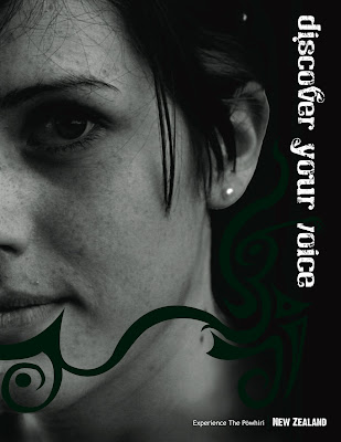
New Zealand Tourism Ad
Objective: Create an tourism ad campaign for a paticular location. You must research your chosen location to ensure that you succesfully convey certin aspects of the place or culture. You must produce three diferent ads for the campaign.
Solution: The place I chose to do my campaign for was New Zealand. I wanted a place that had a unique and strong culture to draw upon in my ads. New Zealand has a rich and strong cultural background with the Maori people. There are many traditions and rituals to draw from. I wanted to incorporate the unique designs of the Maori Ta Moko (tattoo). They have a welcoming ceremony named Powhiri. This is something that people have to expeirience when they visit New Zealand. That is where the tag "Experience The Powhiri" came from. I wanted the viewers of the ad to invision themselfs in the Maori culture. That is why I placed pictures of your "average Joe" behind the design of the Ta Moko. When the Maori women had a Ta Moko it was mainly only on their chin. This often indicated that they had "speaking rights" or thier opinion was respected.
Print Ad
Print Ad 2
Billboard
Posted by James Walker at 1:38 PM 0 comments
Tuesday, February 10, 2009
A Day For The Life
Objective: Keep track of a twenty-four hour period of time. Create a chart to display your information effectively. You must successfully use an underlying grid structure. Use the typeface you created in the previous assignment for your title and subtitles.
Solution: The title "a day for the life" basically stems from the idea that everyone has something they consider to be "the life." Everything I do in my day goes toward achieving what I consider to be "the life." I wanted to demonstrate this work flow in my design. When I reviewed the data I collected there were three main categories that my activities fell under...family, school, and open(time where nothing was scheduled). I wanted the viewer to be able to look at each category and see the amount it took up in a 24 hour period as well as how it compared, time wise, to the others. To do this I chose a triangular shape. Not only would this allow me to show each category but it would be a continuous flow of time and would reinforce the flow of the piece pointing to "the life." The family category was purposely placed at the base of the triangle because my family is what drives me to achieve my goals.
Posted by James Walker at 2:56 PM 0 comments
Typeface
Objective: Create a typeface to use in your next assignment. The typeface must contain 26 letters and some punctuation. The typeface must show consistency through the various letters.
Solution: I wanted to create something that effectively used thick to thin strokes. I also wanted it to be unlike anything else I had seen before.
Posted by James Walker at 2:46 PM 0 comments
Thursday, December 4, 2008
immix apparel
Objective: Create a business. You must create a logo, letterhead (including envelope and business card), packaging for what ever product your business will sell, and a website.
Solution: I decided to create a clothing company. The company would cater to skaters and snowboarders. I wanted to give the company an east coast feel because a lot of the current companies that cater to the same target market are from California. I decided to name the company immix apparel. The word immix means to blend or mix together different elements. I thought this was fitting for a company that deals with different sports, weather elements etc. I chose black, gray, and red for the company colors to keep with the cold and rigid east coast feel. I wanted to have the unique shape of the logo echoed through different aspects of the project. For the packaging I really tried to bring in different textures that you might find in an urban environment. The shopping boxes are sprayed with an asphault and concrete type texture. The box handles are made from metal cable. I also made a metal hang tag and key chain out of brass, that has the logo etched on it. I wanted to take an unconventional approach to the website. I designed it so that all the page elements would fit on one page so you would not have to scroll down. This allowed me to move the navigation to the bottom of the page. The product selector allows you to pan from left to right to select a product or sponsored athlete. When a product or athlete is selected the large image rotates, showing a 360 degree view.
Letterhead

Packaging 


Website


Posted by James Walker at 5:17 PM 0 comments


